Your logo ends up on your website, your invoices, your van, your business cards and every social profile you own. It is usually the first thing someone learns about your business, and often the only part they remember. Getting it right early saves you paying to redo all of that later.
This covers what a logo does for a business, the four things worth judging a design against, what to ask your designer to hand over, and how the logo fits alongside the rest of your brand.
What a logo does
A logo is shorthand. It has to carry your character in a single mark, small enough for a browser tab and still readable on a sign across a car park.
Think about the McDonald’s arches, the Nike swoosh, or Apple’s bitten apple. None of them describes what the company sells. They work because the same simple shape has been used consistently for decades, and that repetition is what attached the meaning to it. The shape did not start out meaningful. It became meaningful.
For a small business the scale is different but the mechanism is identical. A customer who sees your mark on a van, then again on a quote, then again on an invoice has been told three times that you are an established operation. A mark that looks improvised, or that changes every couple of years, undoes that quietly and continuously.
Four things to judge a design against
When a designer puts concepts in front of you, it is easy to react on taste alone. These four questions are more useful than whether you like it on the day.
Simplicity
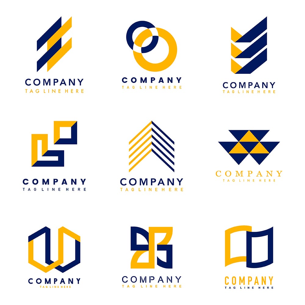
The marks that last tend to be the plainest. A simple logo survives being shrunk to a favicon, embroidered on a polo shirt, etched on a sign, or printed in one colour on a receipt. Simple is not the same as boring — the Apple and Nike marks are about as reduced as a shape can get, and neither is dull.
The practical test: if a design only reads at full size, in full colour, on a white background, it will cause you problems every single time you try to use it somewhere new.
Relevance
The design should suit your industry and the people who buy from you. A software company and a children’s bookshop are not talking to the same person, and a mark that fits one will look wrong on the other. This is less about obeying category conventions than about not actively contradicting them: a law firm with a cartoon mascot is fighting its own logo every time it sends a letter.
Uniqueness
Check your competitors before you commit. If three firms in your town already use a similar shape or the same shade of blue, a fourth is not memorable, it is forgettable. Avoid the obvious cliché for your trade, and be careful with stock icons: a mark you did not commission is a mark somebody else can license too.
Versatility
Your logo has to work in colour and in black and white, on light backgrounds and dark, in print and on screen, wide and square. Ask for those variants up front: a horizontal lockup, a stacked version, an icon-only mark, and a single-colour version. You will need all of them eventually, and commissioning them later always costs more than including them at the start.
What to ask your designer to hand over
This is where a lot of small businesses get caught out. A logo delivered as a single JPG is close to useless a year later. Ask for:
- Vector source files (SVG, AI or EPS) — these scale to any size without going blurry, and a sign-writer or printer will ask for them
- PNG exports with transparent backgrounds, at a few sizes
- A single-colour and a reversed (white) version
- The exact colour values, in HEX for screen and CMYK or Pantone for print
- The names of the typefaces used, and whether you are licensed to use them
Also settle who owns the artwork in writing before work starts. Ownership of a commissioned design is not automatic, and it is a great deal easier to agree at the beginning than to unpick later.
Slogans and the rest of the brand
A logo is one part of a brand, not the whole of it. A short line alongside it does a lot of work: “Just Do It” and “I’m Lovin’ It” are now inseparable from the marks they sit beside.
The rest is the material you use every day. Your colour palette, your typefaces, the style of photography you choose, and the way you write. When those hold together, a customer recognises you before reading a word. When they do not, every piece of marketing looks like it came from a different company.
Consistency matters more than sophistication here. A modest palette used the same way every time will do more for you than an elaborate one applied at random.
Where to start
Write down what your business does, who buys from you, and the three words you would want a customer to use about you. That brief is worth more to a designer than a folder of logos you happen to like, because it gives them something to aim at rather than something to copy.
Then expect to iterate. First drafts are rarely the answer, and the useful part of the process is the conversation about why one direction fits your business and another does not. A designer who shows you a single concept and calls it finished has skipped that conversation.
If you would like help with any of this, we design logos and brand identities for businesses, non-profits and schools. Tell us about your organisation and we will come back with concepts, along with a straight answer on cost and timing.